
You're viewing Apigee Edge documentation.
Go to the
Apigee X documentation. info
What does this dashboard tell me?
The Geo Map dashboard tracks traffic patterns, error patterns, and quality of service across geographical locations. You can view information about all your APIs, or zoom in on specific ones. This dashboard helps you assess:
- API growth trends - Use the Traffic metric to see where your traffic is coming from. By using different time periods you can see which countries generate the most traffic at which times. You can also record traffic rates over different time periods to see trends in growth.
- Error trends - Use the Error Count metric to see where API errors are coming from. By using different time periods you can see which countries generate the most errors at which times. You can also record error rates over different time periods to see trends in growth.
- Quality of service - Use the Average Response Time and Average Target Response Time metrics to see how your backend services are performing by country.
The GeoMap Dashboard
Access the GeoMap dashboard, as described below.
Edge
To access the GeoMap dashboard using the Edge UI:
- Sign in to https://apigee.com/edge.
- Select Analyze > End Users > Geomap.
Classic Edge (Private Cloud)
To access the GeoMap dashboard using the Classic Edge UI:
- Sign in to
http://ms-ip:9000, where ms-ip is the IP address or DNS name of the Management Server node. - Select Analytics > Geomap.
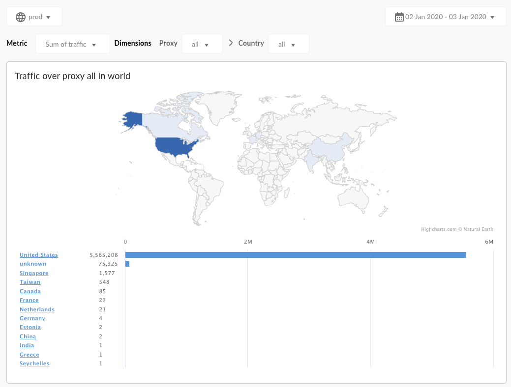
The dashboard opens as shown below:
What does this dashboard measure?
By default, the dashboard displays the Traffic metric. Select the metric to measure from the Metric dropdown menu.
| Metric | Description |
|---|---|
| Traffic | Also known as throughput. The number of API requests and resulting responses seen by the organization. |
| Error Count | The total number of all API requests that are unsuccessful, that is, the request does not deliver a response as desired by the end user. |
| Average Response Time | The time an API takes to respond to an incoming request. |
| Average Target Response Time | The average time it takes the target endpoint to respond to an incoming request for the selected period. |
What else do I need to know about this dashboard?
By default, the dashboard displays metrics for all API proxies. Alternatively, select an API proxy to measure from the Proxy dropdown menu.
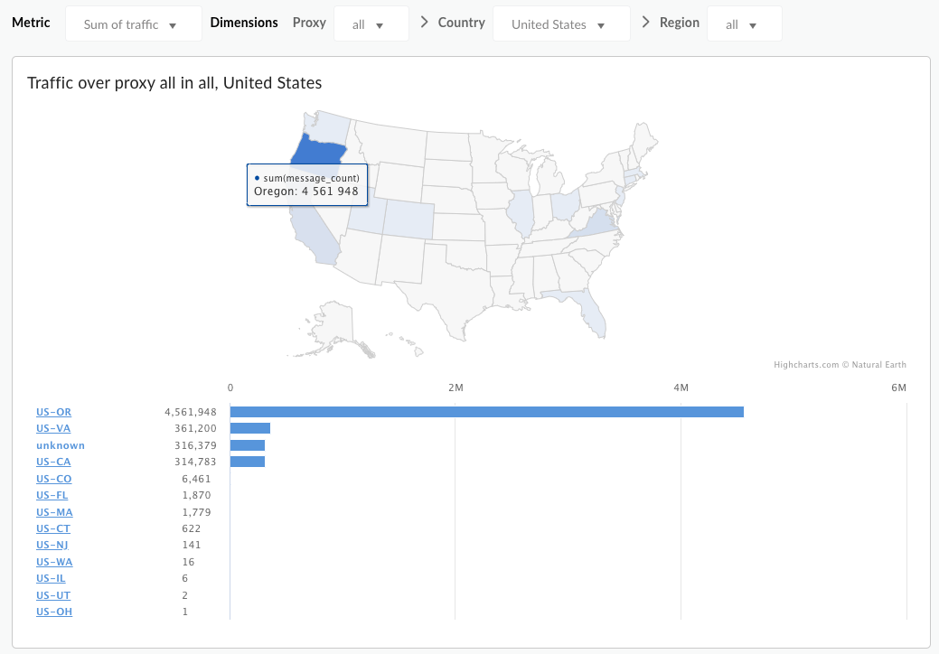
Select an entry under the Country list to drill down on specific countries, states, and cities (depending on the specific geography of the country you are interested in). Any country for which metrics are recorded will appear in this menu. For example, you can look at United States data, then select a state, and then view a list of cities from which traffic is generated. City drilldown is currently available only for the United States and Canada.
This dashboard uses standard controls, like the date selector, hovering over maps for more context, exporting data to CSV, and so on. To learn more, see Using the analytics dashboards.