You're viewing Apigee Edge documentation.
Go to the
Apigee X documentation. info
Analytics dashboards help you see and detect changes in your API ecosystem at a glance. The ability to see what has changed over time helps you identify problems and take corrective action quickly.
For a quick overview of Edge API Analytics, who uses them, and why, see API Analytics overview.
For a quick overview of the analytics dashboards, watch this video.
What can you learn from the dashboards?
Has there been a sudden spike or drop off in API traffic? Which app developers are most successful? What is the adoption rate of your API among developers? Which API methods are most popular? The Edge Analytics dashboards are designed specifically to answer questions like these.
In the background, Apigee Edge collects information as data passes through your APIs. The dashboards provide a powerful way to use this data immediately. If you see something of interest in a graph or chart, an anomaly or sudden change, you can then drill deeper to uncover as much detail as you require. If you notice that a particular developer is experiencing a lot of errors or a sudden drop in traffic, you can contact that developer proactively. Dashboards give you insight into your APIs that allows you to take action.
What's the delay interval for receiving data?
Can I customize the dashboards?
Yes, many dashboards let you select which metrics to analyze, date ranges, data aggregation intervals, and many other variables. If the built-in dashboards do not suit your needs, you can create custom reports, which are dashboards you create by selecting the analytic dimensions and metrics that you wish to analyze. Custom reports let you "drill down" into your API's analytic data until you achieve the granularity you require.
What are the most common features in the dashboards?
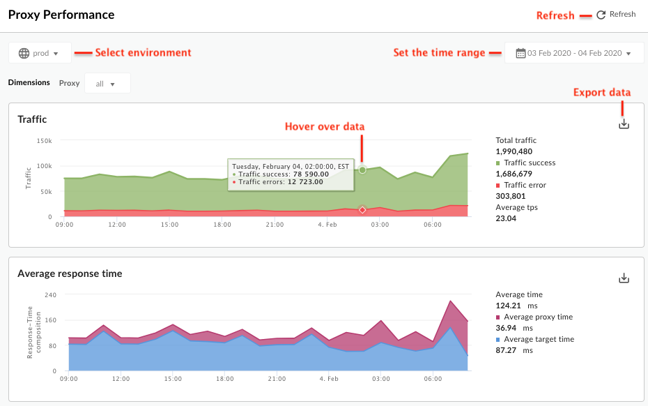
Dashboards have a set of common features, including setting time range, click and drag zooming on charts, mouse-over hover for more details on charts and other regions, and selectors for choosing the data to display in a chart. If you understand how to use one kind of dashboard, you'll be comfortable using the others.
The following figure highlights these common feature areas:

-
Set the time range - Set the time range over which the dashboard displays its data.
- Refresh - Refresh the dashboard data.
- Environment - Select the environment in the organization.
- Zoom in - You can zoom in on chart data by clicking and dragging a region of the chart. When you complete the drag, the chart zooms in to the selected region.
- Export data to file - Download a single CSV file that contains the set of data for the chart.
- Hover mouse over graphs - You can mouse over any point on a graph for more context about the data at that point.
Reading dispersion box plots
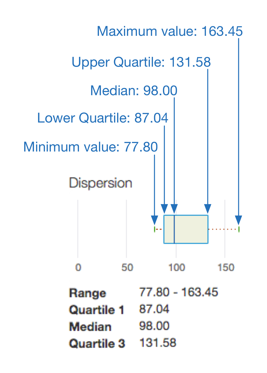
When an analytics report illustrates an average, as well as minimum and maximum values, it display an accompanying dispersion box plot, as shown in the custom report below:

At a glance, a dispersion box plot enables you to see the central tendency and dispersion of your data. A dispersion box plot surfaces the five key numbers when it comes to illustrating averaged analytics data:

In this example:
- The area within the box indicates the most typical average target response times experienced by your traffic — 50% of your traffic, to be exact.
- The line extending from the left side of the box indicates the average target response times experienced by 25% of your traffic.
- The line extending from the right of the box indicates the average target response times experienced by the remaining 25% of your traffic. The longer these lines, or “whiskers,” the more extreme your outlier values.
What is the Apigee Edge dashboard in the Classic UI?
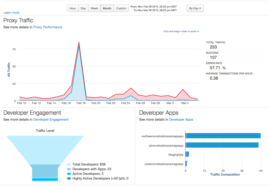
The Apigee Edge dashboard is the first thing you see when you log in to the Classic Edge UI. It gives you a quick overall view of your API program -- patterns for API traffic, developer engagement, and developer apps. And, you can drill in on each chart for a more detailed view.
You can see this dashboard anytime by selecting Dashboard from the main Apigee Edge menu.
This dashboard contains three charts as shown below:

| Chart | Description |
|---|---|
| Proxy traffic |
All the API traffic for an organization over the selected period of time. Traffic, also called "throughput", represents the number of API requests and responses seen by an API organization. Click the Proxy Performance link to drill down to a more detailed view. |
| Developer Engagement |
Measures the average number of API calls for registered developers during the selected period of time. Shows you active and highly active developers (greater than 50 transactions per hour). Also shown are the total number of developers who have signed up to use your APIs. Click the Developer Engagement link to drill down to a more detailed view. Note: It's possible that the Developer Engagement could reflect higher numbers for a Week timespan than for a Month. This is because engagement is calculated based on the average number of calls during a specific period of time (week/month). You could have a large number of developers register their apps, but for a period of time the apps are not generating traffic (perhaps because their apps are still in development). If traffic starts later, in the most recent week, then calculated engagement will be higher for the most recent week than over the previous month, because most of the traffic was generated in the most recent week. |
| Developer Apps |
Traffic for your top-performing developer apps for the selected time period is displayed in this chart. Click the Developer Apps link to drill down to a more detailed view. |
