You're viewing Apigee Edge documentation.
Go to the
Apigee X documentation. info
Custom reports enable you to drill-down into specific API metrics and view the exact data that you want to see. You can create a custom report by using any of the metrics and dimension built into Edge. In addition, you can attach the StatisticsCollector policy to your API proxies to collect custom metrics, such as user or product ID, price, REST action, target version, target URL, and message length.
Videos
Watch the following videos to learn more about custom reports.
| Video | Description |
|---|---|
| Create custom reports using the UI | Learn how to create custom reports using the Edge UI. |
| Custom reports overview | See an overview of using custom reports. |
| Track API latency | See how to track API latency using custom reports. |
| Track API error responses | Track API error responses using custom reports. |
About custom reports
When building a custom report, you'll select the data you want to see (metrics), group the data in meaningful ways (dimensions), and optionally limit the data returned based on specific characteristics (filters) of the data.
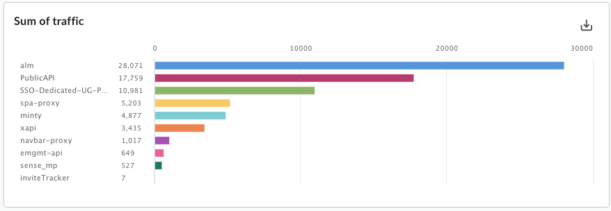
You can also set the chart type displayed in the custom report as a column or line chart. The following images show chart examples for the transactions per second metric grouped by the API proxy dimension:
Column - each API proxy is represented by a different column:
Line - each API is represented be a different line:

Setting metrics and dimensions
The metrics you choose for your custom report specify the data that you are trying to measure. Common metrics include:- Transactions per second
- Response time
- Policy errors
Some metrics let you set an aggregation function to run against the metric. For example, you can use the following aggregation functions with the response time metric:
avg: Returns the average response time.min: Returns the minimum response time.max: Returns the maximum response time.-
sum: Returns the sum of all response time.
Not all metrics support all aggregation functions. The documentation on
metrics contains a table that specifies the metric name
and the function (sum, avg, min, max) supported by the metric.
The dimension specifies how to group the metrics data. For example, you want to create a custom report showing the response time metric. You can use dimensions to group the metrics data by API product, API proxy, or developer email to obtain:
- The response time per API product
- The response time per API proxy
- The response time per developer email
The way the dimension is displayed in the chart of the custom report depends on the chart type:
- Column: Each column corresponds to a different value of the dimension.
- Line: Each line in the chart corresponds to a different value of the dimension, and the x-axis represents time.
Creating custom metrics and dimensions
Add the StatisticsCollector policy to your API proxies to collect custom analytics data, such as user or product ID, price, REST action, target version, target URL, and message length. The data can come from flow variables predefined by Apigee, request headers, query params, or custom variables that you define. Once the data has been collected, you can then create a custom report to view that data.
The way you display the custom analytics data in a custom report depends on its data type:
- For data of type string, reference the statistical data as a dimension in a custom report.
- For numerical data types (integer/float/long/double), reference the statistical data in a custom report as either a dimension or a metric.
See the StatisticsCollector policy for examples of collecting custom analytics data.
Setting filters
A filter lets you limit the metrics data displayed in the custom report by setting specific characteristics on the metrics data to return. For example, you can create a filter so that you see metrics data only for a response time greater than a specific value or only for an API proxy with a specific name.
Filters use a conditionl syntax that lets you build complex filters using operators such as
eq, ne, gt, lt, and more.
Custom report examples
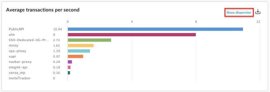
In the simplest type of custom report, you specify a single metic and a single dimension. For example, you define a custom report with the following settings:
- type = Column
- metric = Average transactions per second
- dimension = API Proxy
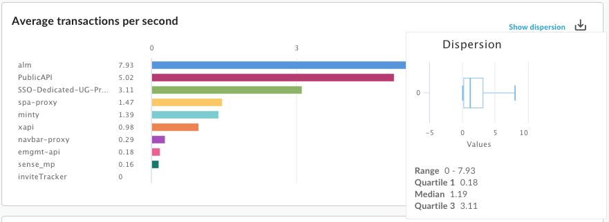
The custom report contains a column chart with the "Average transactions per second" metric data grouped by the API proxy dimension:
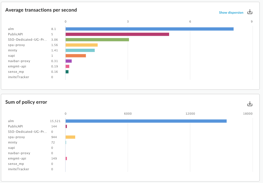
You can add multiple metrics to a custom report. For example, you define a custom report with two metrics:
- type = Column
- metric = Average transactions per second
- metric = Policy Errors
- dimension = API Proxy
The custom report contains a separate chart for each metric:
You can add multiple dimensions to a custom report. For example, you define a custom report with the following settings that includes two metrics and two dimensions:
- type = Column
- metric = Average transactions per second
- metric = Policy errors
- dimension = API Proxy
- dimension = Request verb
The chart initially shows the metrics grouped by Proxy, the first dimension specified when you created the custom report:
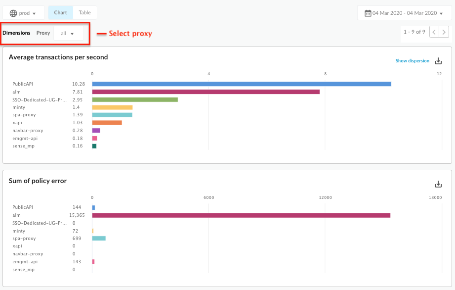
You can then use the Proxy dropdown, corresponding to the first dimension, to select an individual proxy. The updated chart now shows the metrics for the selected proxy by request verb:
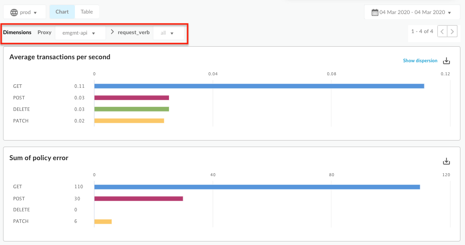
As you add more and more dimensions to the custom report, the UI adjusts to let you drill down into the report by each dimension.
Viewing all custom reports
Access the custom reports page, as described below.
Edge
To access the custom reports page using the Edge UI:
- Sign in to https://apigee.com/edge.
- Select Analyze > Custom Reports > Reports.
Classic Edge (Private Cloud)
To access the custom reports page using the Classic Edge UI:
- Sign in to
http://ms-ip:9000, where ms-ip is the IP address or DNS name of the Management Server node. - Select Analytics > Reports.
The custom reports page displays all custom reports that have been created for your organization, as shown in the following figure:
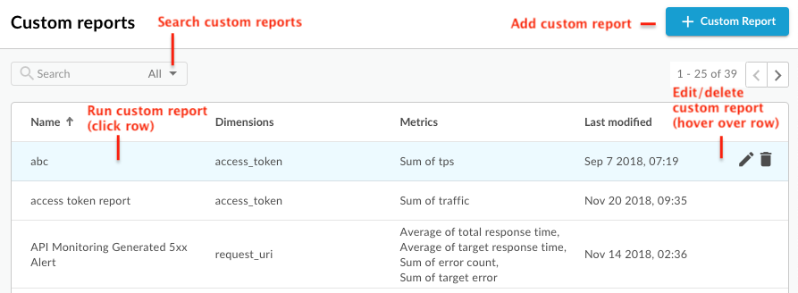
As highlighted in the figure, the custom reports page enables you to:
- View a list of all custom reports.
- Add a custom report.
- Run a custom report by clicking its name in the list. The report is run using the data collected over the last hour by default and the data is displayed in the custom report dashboard. See Exploring the custom reports dashboard.
- Search the list of custom reports by entering all or part of a relevant string in the search box; all displayed fields are searched for the string.
- Delete a custom report.
Exploring the custom report dashboard
The custom report dashboard displays the results of your custom report for a specific time range, including the column or line chart of the specified metric:
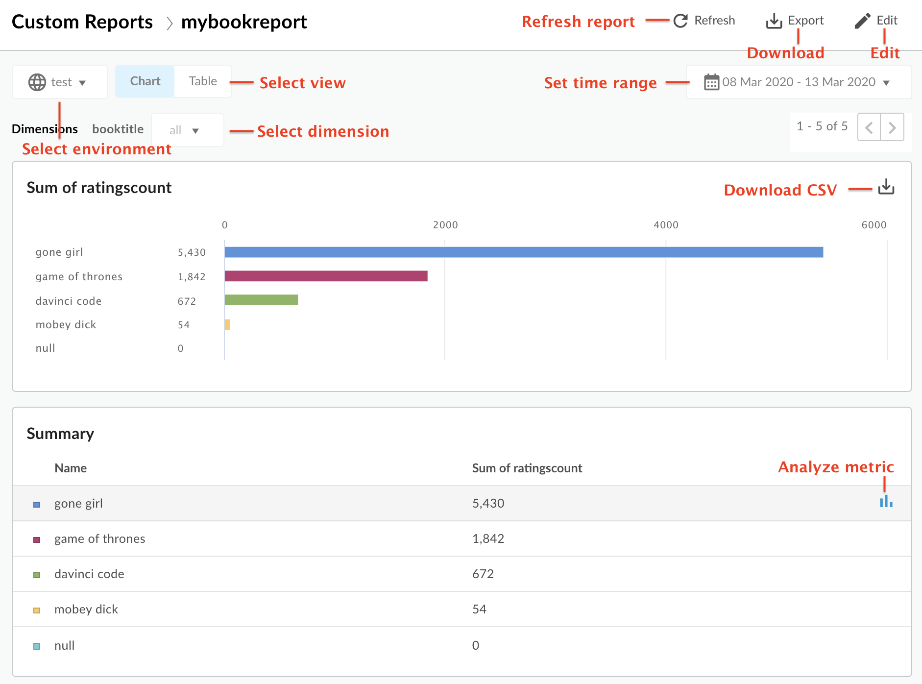
The custom report dashboard enables you to:
- View custom report data for selected time range.
- Select the Environment for which you want to view custom report data.
- Select a specific dimension to filter the custom report data. This area is only enabled when you specify multiple dimensions to the report.
Select the Chart or Table view.
- Analyze a metric by selecting the
 icon
in the table row of the associated metric. View anomalies, and compare it to a previous period or
to other metrics.
 - Run the custom report by clicking and setting the time range.
- Download the custom report as a CSV file. The file is named as follows:
metric.csv. For example:Average_of_total_response_time.csv. - Edit the custom report.
Explore the metric analysis dashboard
If you select the ![]() icon in a summary table row, the following charts appear
(the top chart only appears if you configured the report to use multiple metrics):
icon in a summary table row, the following charts appear
(the top chart only appears if you configured the report to use multiple metrics):
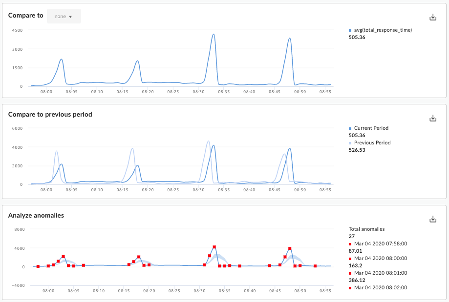
These charts display the following information:
- Compare to: If you configured the report to use multiple metrics, compare the metrics to each other.
- Compare to previous period: View the metric for the previous time period. For example, if you chose to view the custom report for the last 24 hours, then this chart show the data for the previous 24 hour period.
Analyze anomalies: Displays any outlying data points in the report data. This chart displays two values:
- The moving average of the metric displayed as a line. For a given point on the line, the value of the moving average is calculated as the average of the metric value at that point in time and the values of the metric for the two previous data points.
- The blue area of the chart defines the average max and average min values of the metric. The average max is 1.2 * (moving average), and average min is 0.8 * (moving average).
If the moving average is out of the range of the average max or average min, it is considered a possible anomaly and drawn as a red dot on the chart.
Adding a custom report
By adding custom reports, you can create a set of charts that provide insight into every aspect of your API program.
After you add the custom report, you must run it synchronously or asynchronously.
To add a custom report:
- Access the Custom Reports page.
- Click + Custom Report.
- In the Basic section, enter the following information:
Field Description Report name Name of the report. Report description Description of the report. Chart type Select the style of chart to use to present your custom analytics data. - Column: X-axis represents groups designated by dimensions.
- Line: X-axis represents time.
- In the Metrics section:
- Click the
 icon for Metrics.
 - Select the metric that you want to analyze.
- Select an Aggregate function to display the Sum, Average, Min, or Max values.
- Click Save.
- Click the
 icon to add additional metrics.
- Click the
- In the Dimensions section, click
 and select a
dimension,
such as "Proxy", to constrain the data set
used to generate the reports. You can add additional dimensions to further constrain the
data.
 In the Filters section, further narrow the data displayed by adding filters to your report definition. For example, you could add a filter that excludes data for the weather API proxy or developer jane@example.com.
- Click
 and select the Name of the entity you want to filter on, an
Operator such as = or !=, and a Value.
 - Click Add to save the filter.
- Click
 to add additional filters, and select an AND or OR
connector.
- Click
To limit who can access the custom report, edit the custom Roles that are defined for the report.
- Click
 to edit the custom role settings.
 - Select the custom role required to access the report and the access level (view, edit, delete).
- Click Add.
- Click
 to edit additional roles.
- Click
- Click Save to save the report.
Running a custom report
Edge Analytics lets you run a report synchronously or asynchronously.
For a synchronous report, you run the report request and the request is blocked until the analytics server provides a response. However, because a report might need to process a large amount of data (for example, 100's of GB), a synchronous report might fail because of a time out.
A synchronous report can have a maximum time range of 14 days. If you select a time range of 15 days or greater, then the report is always run asynchronusly.
For an asynchronous report, you run the report request and retrieve the results at a later time. Some situations when asynchronous query processing might be a good alternative include:
- Analyzing and creating reports that span large time intervals.
- Analyzing data with a variety of grouping dimensions and other constraints that add complexity to the query
- Managing queries when you find that data volumes have increased significantly for some users or organizations.
This document describes how to initiate an asynchronous report by using the UI. You can also use the API, as described in Using the asynchronous custom reports API.
To run a custom report for a specific time range:
- Access the Custom Reports page.
- Select the report to run. By default, the report displays data for the previous hour.
To run the report for a different time range:
- Click in the time range area at the top of the report to open the Custom Report Time Selection pop up.
- Select either:
- A predefined time range, such as Last Hour, Yesterday, or Last 7 Days.
A Custom Range by selecting a From/To date and time, or use the calendar to select start and end dates. Click UTC to use Universal Time Coordinated (UTC).
- To run the report, select one of the following:
Apply to run the report synchronously. The results will be displayed in the custom report dashboard after the report completes. If the report takes longer than 60 seconds to run, it will be converted automatically into an asynchronous report.
Submit Job to run the report asynchronously as a background job. The following dialog appears:

Click View Status in the dialog to view the status of the custom report job.
Viewing asynchronous custom report jobs
To view asynchronous custom report jobs, select one of the following:
- Click View Status in the Report Submitted as Background Job dialog.
- Select Analyze > Custom Reports > Report Jobs from the left navigation bar.
The Report Jobs page is displayed, as shown in the following figure:

The Report Jobs page enables you to:
View all asynchronous custom report job results that have been submitted in the last 7 days.
Select the environment for which you want to display custom report jobs.
To view the custom report, make sure its Status is completed. Then move the mouse over the row corresponding to the report. An
 and a
and a
 icon appear.
Selcet the
  to view the report.
Download the custom report by clicking
 .
.The full report is downloaded as a ZIP file named
OfflineQueryResult-xxx.zipwhich contains the CSV files.Search the list of custom reports by entering all or part of a relevant string in the search box; all displayed fields are searched for the string.
Editing a custom report
To edit a custom report:
- Access the Custom Reports page.
- Move the mouse over the name of the report that you want to edit.
The edit
 and delete
  icons appear on the right side of the page.
 - Click the edit icon.
- Edit the custom report details.
- Click Save.
You are returned to the custom report results.
Deleting a custom report
To delete a custom report:
- Access the Custom Reports page.
- Move the mouse over the name of the report that you want to edit.
The edit
 and delete
  icons appear on the right side of the page.
 - Click the delete icon to delete the report.
