You're viewing Apigee Edge documentation.
Go to the
Apigee X documentation. info
What does this dashboard tell me?
The Traffic Composition dashboard measures the relative contribution of your top APIs, apps, developers, and products to your overall API program.
Use the report to detect business problems such as lower traffic trends or diminishing contribution from key apps and developers. Based on this data, you can decide what corrective action to take. You can also get early notification of new entities that contribute to API traffic, and take actions to respond — for example, you can determine which new developers are highly contributing and include them in nurturing programs.
The Traffic Composition dashboard
Access the Traffic Composition dashboard, as described below.
Edge
To access the Traffic Composition dashboard using the Edge UI:
- Sign in to https://apigee.com/edge.
- Select Analyze > Developers > Traffic Composition.
Classic Edge (Private Cloud)
To access the Traffic Composition dashboard using the Classic Edge UI:
- Sign in to
http://ms-ip:9000, where ms-ip is the IP address or DNS name of the Management Server node. - Select Analytics > Traffic Composition.
The dashboard opens as shown below:

What does this dashboard measure?
This dashboard has two measurement modes, which you select with the Overview and By Dimension buttons:
| Mode | Description |
|---|---|
| Overview | Gives you a quick glance at traffic patterns for proxies, developer apps, products, and developers. For example, use this view to see which proxy, app, product, or developer is generating the most traffic. |
| By Dimension | Let's you drill in to see a more detailed view of proxy, developer app, product, and developer traffic. |
What the Overview mode tells you
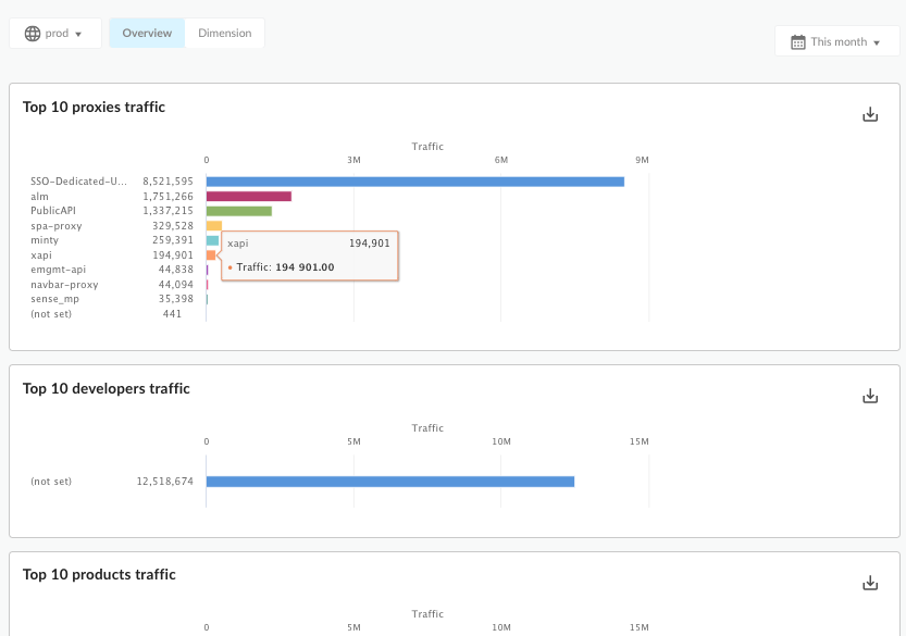
Click Overview to display this mode. This mode presents a set of straight-forward graphs showing traffic patterns proxies, developer apps, developers, and products.
The following figure shows part of the traffic composition overview page:
| Mode | Description |
|---|---|
| Top 10 Proxies Traffic | Shows the top 10 proxies measured by API traffic. |
| Top 10 Developers Traffic | Shows the top 10 developers measured by API traffic. |
| Top 10 Products Traffic | Shows the top 10 products measured by API traffic. |
| Top 10 Apps Traffic | Shows the top 10 developer apps measured by API traffic. |
What the By Dimension mode tells you
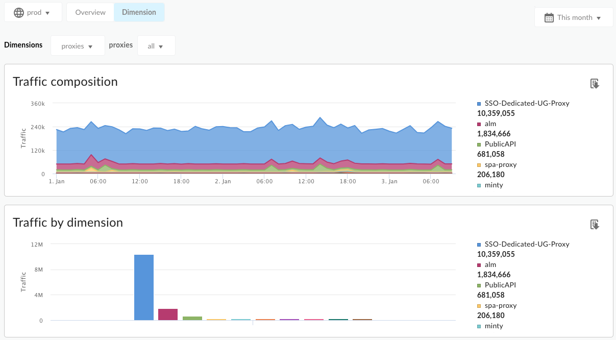
Click By Dimension to display this mode. This mode lets you drill in to see traffic pattern details for specific proxies, developer apps, developers, and products. For example, you can see at a glance how traffic for a specific proxy compares to all other proxies.
1. Select a dimension to examine. Dimensions include:
- Developer Apps
- Developers
- Products
- Proxies
2. Select the dimension instance to examine. For example, if the dimension is Developers, select a developer from the dropdown list, or select All to see metrics on all developers.
If you select All for a dimension, the dashboard offers charts that compare all entities together. For example, the Traffic by Dimension chart compares API proxy traffic for all API proxies in the organization.
Charts you will see in this mode include:
Traffic Composition
Shows the traffic for all entities of the selected dimension or all entities combined over the selected time interval.

| Mode | Description |
|---|---|
| All Dimensions Traffic | Shows the traffic for all of the selected dimension in one chart. Dimensions can include API proxies, developer apps, developers, or products. |
| Proxy-specific traffic | Shows the traffic for the selected dimension. |
Top 10 Monthly Composition
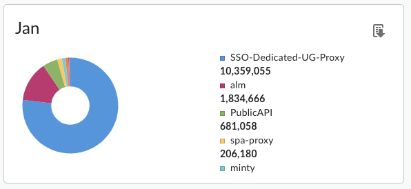
This view's pie charts let you quickly compare traffic patterns for all of your proxies, developer apps, products, or developers.

What else do I need to know about this dashboard?
This dashboard uses standard controls, like the date and data aggregation selectors, hovering over graphs for more context, exporting data to CSV, and so on. To learn more, see Using the analytics dashboards.
