
You're viewing Apigee Edge documentation.
Go to the
Apigee X documentation. info
Using the page editor, you define your portal content using Markdown or HTML.
Explore the page editor
Access the page editor by clicking the name of a page when viewing the list of pages, as described in Manage the pages in your portal.
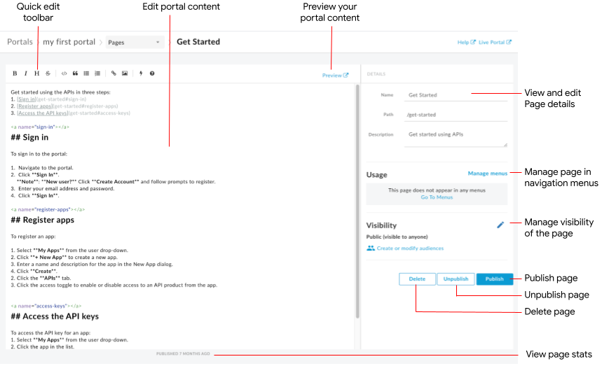
As highlighted in the previous figure, the page editor enables you to:
- Edit portal content and add Angular Material components in the left pane
- Use the quick edit toolbar to apply formats or insert markdown tags quickly
- Edit page details, such as name, path, and description, in the right pane
- Manage the visibility for a page in the right pane
- Preview the portal content
- Publish or unpublish a page (see Publish your portal content)
- Manage the page in your navigation menus (see Set up navigation)
- View the amount of time since the page was last published
- Delete a page
Editing content in the page editor
Markdown is a simple formatting language that uses plain text markup that is both easy to read and write. Its syntax is specified using punctuation characters. Markdown is converted to HTML before rendering in your browser.
The quick edit toolbar at the top of the page editor provides shortcuts for applying formats (such as bold, italic, and so on) or inserting Markdown tags (such as lists, images, links, and so on). For a quick summary of Markdown syntax, click  in the quick edit toolbar to view the Markdown syntax quick reference.
To undo or redo the last edit, click Command-z or Command-Shift-z, respectively.
Markdown is recommended if you want to keep your formatting workflow simple. However, it is not intended to replace HTML. There is a wide range of formatting you can do in HTML that you cannot do in Markdown. For example, you can specify a CSS class for an element in HTML; you cannot do this in Markdown:
<p class="class1">
You can insert HTML anywhere within the content body by simply entering the HTML tags.
For information about HTML tags, see the HTML5 specification.
Add Angular Material components
Angular Material provides a state-of-the-art UI component library. Angular Material components enable you to quickly easily construct consistent, responsive, and accessible user interfaces utilizing modern design principles.
Available components
The portal experience is built using Angular Material, and a limited set of Angular Material components may be used in pages, summarized in the following table.
| Component | Example |
|---|---|
| Buttons | The following code creates a rectangular button with elevation.The following code creates a circular button with a transparent background that includes the warning icon. The color of the button is defined using the warn color palette. |
| Card | The following code creates a card. The card includes button and icon components, as well as heading and body text. The color of the button is defined using the primary color palette. |
| Icon | The following code creates a checkmark icon. For a complete list of icons that are supported, see Material Design - Icons. |
| Toolbar | The following code creates a simple toolbar with text and a shopping cart icon.
|
Manage the visibility for a page in your portal
Manage the visibility of a page in your portal by allowing access to:
- Public (visible to anyone)
- Authenticated users
- Selected audiences (if you have enrolled in the beta release of the audiences feature)
To manage the visibility for a page in your portal:
- Click Manage adjacent to the audience in the right pane of the page editor.
- Select the visibility setting.
If you have enrolled in the beta release of the audiences feature, select one of the following options:
- Public (visible to anyone) to allow all users to view the page.
- Authenticated users to allow only registered users to view the page.
- Selected audiences to select the specific audiences that you want to be able to view the page. See Manage the audiences for your portal.
To manage your audiences, click Create or modify audiences.
Otherwise, select one of the following options:- Anonymous users to allow all users to view the page.
- Registered users to allow only registered users to view the page.
- Click Apply.
Preview portal content
To preview the portal content, click Preview in page editor toolbar. Navigate through other pages in your portal to preview the content, as desired.
Publishing portal content
To publish portal content, click Publish in the right pane. To unpublish the portal content, click Unpublish in the right pane. See also Publishing your portal content.
Delete a page
To delete a page from the portal editor, click Delete in the right pane of the page editor. You are prompted to confirm the operation.